
Have the best of both worlds with a creative, yet functional display in your exhibition booth which is sure to catch anybody’s attention. Get inspiration from Zipgrow (formerly known as Bright Agrotech), a startup that offers vertical farming technology, software, and services, who cleverly created an exhibition wall that doubles as a product display and a demonstration of their products and services.
2. Theme Up
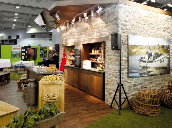
Let your theme guide you and be clear about what you’re trying to promote. Fernleigh Design created an exhibition booth that aims to promote fresh and organic Welsh produce. Their country-style set-up promotes using fresh, organic, and locally-sourced food. Even the presentation panels, exhibition furniture, and other materials emphasized that farm fresh theme.
3. Interactive and Attractive

Create a unique experience for all trade show attendees. Try to steer away from the typical exhibition designs. Nature’s Path exhibition stall pushes the boundaries of exhibition stand design. They created a memorable, and interactive treehouse display you can actually go up in. To put emphasis on the brand’s sustainability focus, they used eco-friendly materials for their display.
4. Elegant and Unique

A simple design is still elegant and unique. Take notice of Novel Ingredients, who created a simple yet creative display by setting up small, private conference rooms for one-on-one consultations with the trade show representatives. While some of the trade show team is talking with people in the booth, the open exhibit areas engage the visitors with brand and product information using branded furniture and LED walls. Such a simple design can be very effective, due to the emphasis on meaningful discussions about the brand.
5. Small Space, Big Impact
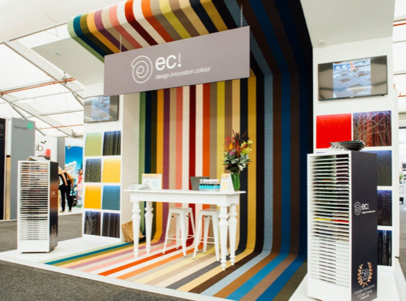
Maximize your booth space, no matter its size. Limited space does not mean limited designs. Get crafty and expand your space upwards. Be inspired by E.C. Carpet’s exhibition booth. They could not extend their display horizontally, so they made use of the vertical space. By creating a floor-to-ceiling carpet effect using a customized exhibition wall, their space instantly appeared so much bigger than it actually is. They also balanced bright colours with white exhibit attributes to give it a little more oomph.
6. Colour Splashes

Liven up your exhibition stand with bright and bold colours. Colour makes your booth stand out and turn heads. The Store pop-up shop exhibition is one of the best examples of using colour to your advantage. While the stand is very bold and bright coloured, it does not steal the spotlight from featured products, but rather helps visitors see them in a more interesting setting as opposed to on display at a shop.
7. Don’t Judge a Book By Its Cover
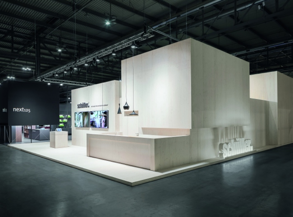
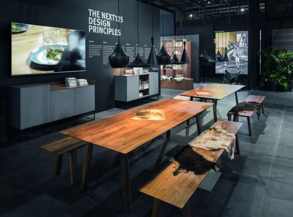
Looks can be deceiving. On the outside, Schüller Möbelwerk exhibition stand by Dart is a simple, bright, and modern arrangement of cubes with the brand’s logo. On the inside, however, you are greeted by a dark, luxurious, and expensive-looking kitchen and dining room space with black walls with a matte finish, black powdered aluminum structures, and polished wood furniture. This kind of design makes people curious to take a peek at what’s inside the exhibition.
8. Tech-it-out

Use technology in your exhibition stand design to get an advantage over your competitors at the fair. It can bring your exhibition to life and give fair visitors a unique and memorable experience. Take the Wonderwall, a 100-million pixel LED digital screen created by 2LK for Intel, as an example. It has a motion sensor capability that detects the movements of the attendees and then creates cool effects according to their actions. The booth’s team used this technology to show their presentation to the trade fair attendees.
Your video screens don’t have to be as massive and interactive as the Wonderwall. You can still captivate a crowd by using an awesome video presentation that makes the visitors stop by your stand and learn more about your company.
9. Simple Concept, Great Execution

A simple concept can be levelled up by great execution. SplashTacular, a US-based water slide manufacturer, had the simple idea of creating an exhibition booth design that made people feel they were inside a waterslide. They created consecutive, cylinder-like arches for their booth and projected water reflections on the roof of these structures to create the feeling of being inside a huge water slide. It also creates the impression that you are surfing a huge wave.
10. A Little Illumination

Have good lighting in order to take the whole look of your exhibition stall design to a whole new level. Fasetto LLC’s exhibition booth at the International Consumer Electronics Show in 2017 was already impressive with its massive well-designed space and 20-foot sculpture. However, the purple hue lighting enhanced the entire feel of the exhibition. It made the booth environment much richer and more vibrant. Try experimenting with coloured lighting in your exhibition design as well.
It’s easy to be creative when you have such amazing inspirational examples on your hands. We are sure that now you are properly motivated to create a masterpiece exhibition stand.
